Burndown Chart
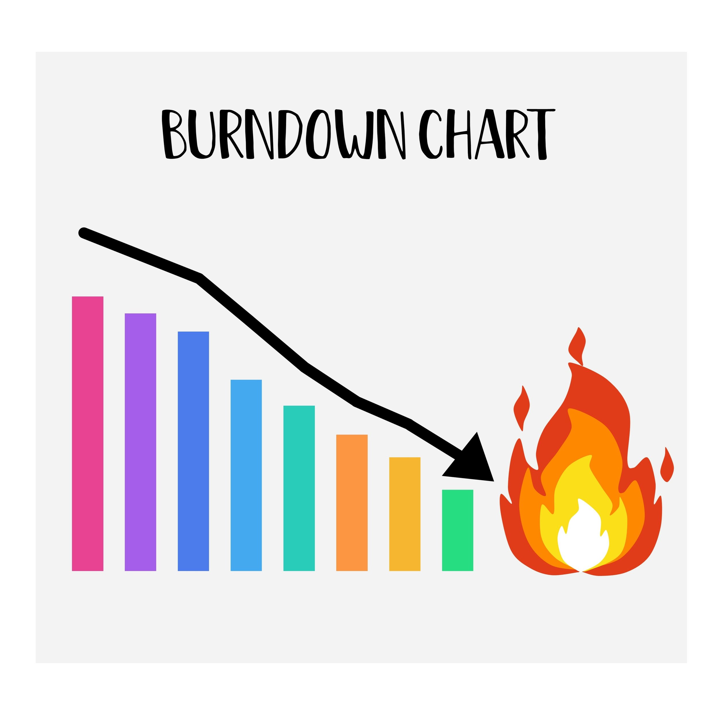
A burndown chart is a visual tool used in project management, particularly in agile software development, to track the progress of a project over time. It helps teams and individuals understand how much work remains to be done before reaching their goal. Here's a simple breakdown of its purpose and function:
Tracking Progress: The main purpose of a burndown chart is to show how quickly a team is completing tasks over a certain period. It helps in monitoring the progress of the project.
Visualizing Workload: The chart visually represents the amount of work left to do (often measured in hours, points, or tasks) against time. As tasks are completed, the line on the chart goes down, hence the name "burndown."
Setting Pace and Deadlines: It helps teams understand if they are on track to complete the project by the deadline. If the line is not going down fast enough, it indicates that the project might be falling behind schedule.
Encouraging Adjustment: The chart allows teams to see bottlenecks or slowdowns in their process. This visibility encourages them to adjust their strategies or efforts to ensure the project is completed on time.
Improving Communication: By providing a clear picture of the project's progress, a burndown chart improves communication within the team and with stakeholders, as it is easy to understand and interpret.
In essence, a burndown chart is a straightforward, visual representation of a project's progress, showing how much work has been completed and how much is left to do within a set timeframe. It's a critical tool for project management, enabling better planning, tracking, and execution of tasks.